Building Accessible React Components That Actually Work
Most teams treat accessibility as a final audit step — something a tool flags and a developer patches under deadline pressure. That approach produces brittle, bolted-on fixes. The components that *actually* work for assistive technology are designed for it from the start.
Start with semantic HTML#
The single highest-leverage decision is choosing the right element. A button, a, nav, main, and figure each carry built-in semantics that screen readers announce correctly. ARIA exists to *fill gaps*, not to recreate what HTML already provides.
- Use
buttonfor actions,afor navigation — never the reverse. - One
h1per page, then a logical heading hierarchy with no skipped levels. - Wrap related controls in
fieldset/legendso their purpose is announced.
Make focus visible and managed#
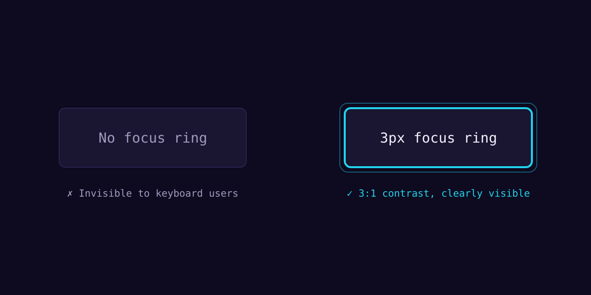
Keyboard users navigate by focus. Every interactive element needs a *visible* focus indicator with at least a 3:1 contrast ratio against its background, and focus order must follow reading order.
export function Button({ children, ...props }: ButtonProps) {
  return (
    <button
      // Visible focus ring meets WCAG 2.2 SC 2.4.13
      className="focus-visible:outline-3 focus-visible:outline-cyan-400"
      {...props}
    >
      {children}
    </button>
  )
}
Respect user preferences#
Animations should never be mandatory. Honor prefers-reduced-motion and provide a calm fallback. In React, a single hook keeps this consistent across every motion component.
The best accessibility work is invisible — users never notice it because nothing ever gets in their way.
Where to go next#
Pair these practices with automated checks (axe-core) and, crucially, real testing with a screen reader. Tools catch maybe 40% of issues — the rest you find by *listening*.